This week for my blog I played around with photoshop. I tried experimenting with hue, sepia and black and white. Although it's the same photograph, I think each one has a different feel and body to it. I really enjoy the rich texture you see in the hue photo, also, I like how the brightest green is on the rule of thirds and the stems get lighter as they spread throughout the photo. The sepia shows more veins and has good lighting, showing more depth in the photo. I think the black and white speaks for itself, it has good value and contrast with the really dark spots in and around the actual leaf.
The central idea for my concentration series is abstract views of nature. I will be using the following principles of design: macro, texture, rule-of-thirds, foreground/middle ground/ background, repetition, leading lines, and movement to portray my ideas through this series. I really enjoy taking macro images. There’s so much detail seeking to be seen in objects we don’t give as much attention to.
Wednesday, February 27, 2013
Thursday, February 21, 2013
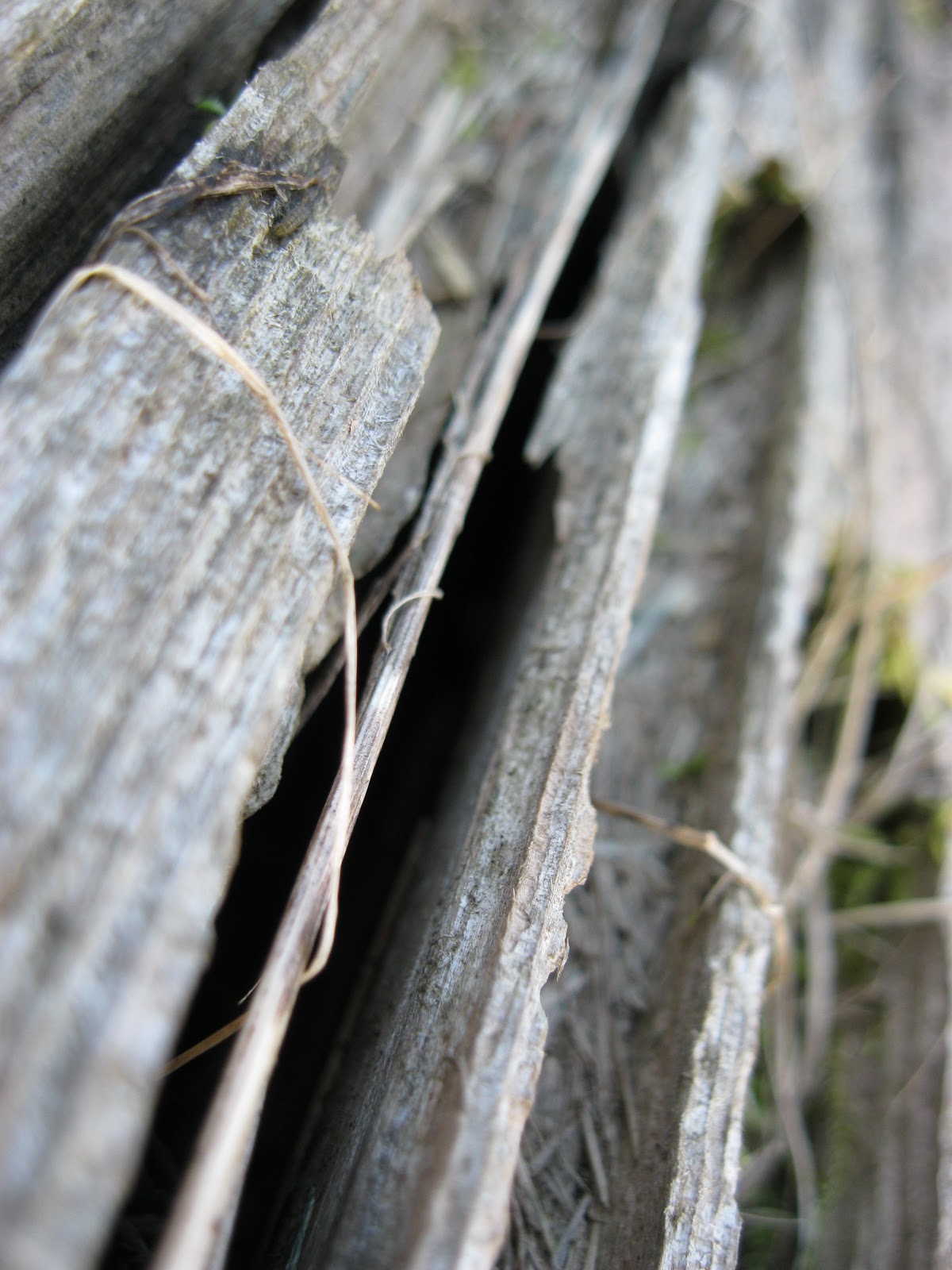
This last weekend, I took photographs of things I thought would show abstract features of nature. I wanted to take photographs of leaves, bark from a tree, branches, cat tails, and acorns. However, I actually took photos of leaves, peeling paint on a house, a piece of old wood, and really cool spheres that were attached to leaves that had fallen from a tree. Peeling paint doesn't exactly fall in the category of nature, but I wanted to show the long-time effects of nature in a different perspective. The same goes for the piece of wood, it has interesting crevices all throughout it which goes to show, again, the effects of nature.
Subscribe to:
Comments (Atom)


