Friday, June 7, 2013


I gained a lot of expertise with doing a gallery show, and also the correct and incorrect doings of putting on a gallery show.
To all incoming AP Photography students, take each assignment seriously. If you put your best effort forward you really do produce great work, and it shows in your artwork if you put forth hard work. But also, have fun taking pictures!!
I gained so much knowledge throughout the entire year, learning which settings work best with the lighting and subjects you want to capture.
I think for next year after first semester, instead of just telling them what needs to be done by a certain date, actually show them so they can get an idea of how long each assignment will take to get finished.
I learned that I am a decent photographer, and have a much better eye for seeing things through a camera lens than when I first started this class. I didn't think I could take a picture of such ordinary things and make them look so appealing to the eye.
I will use this knowledge and take amazing photos when I go to Mexico at the end of the month. I would also like to buy a nice camera for myself sometime in the future and take wonderful every day pictures.

Monday, April 22, 2013

Concentration Commentary

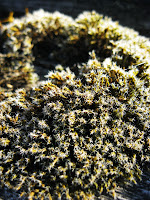
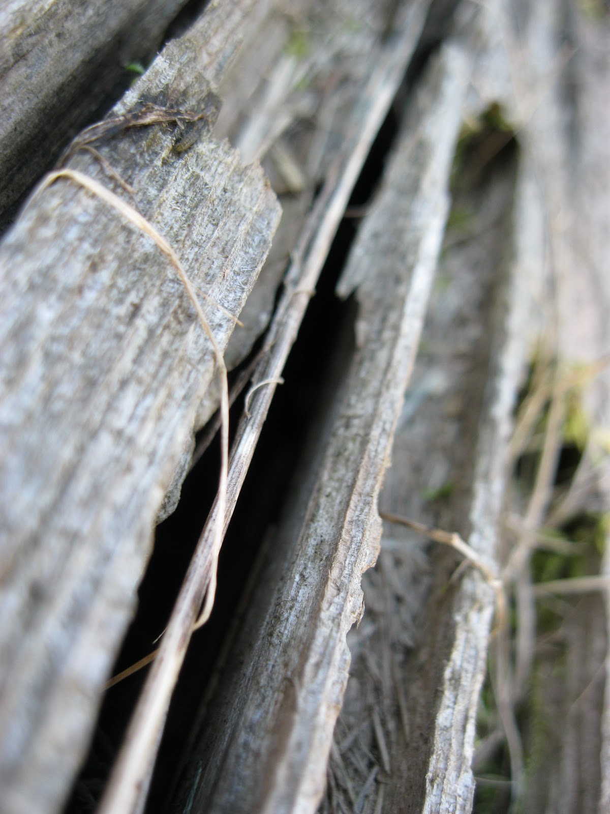
In the beginning of my concentration series I was taking photos of abstraction in nature, but towards the final weeks of preparing my concentration; I started exploring photos dealing with the effects of nature. I explored four different groups: an earth-tone of nature, serene color, deterioration from an angle, and man and nature. My first photograph is a close of up two dried leaves overlapping each other. I think the wariness of the brittle leaves accentuate crispiness which really brings out the detail. My fifth photograph is a bundle of cherry blossoms at the end of a branch. Through the way I shot this image I don’t think it looks like an ordinary flower photo. It appeals more as an effortless fall in the fluffy clouds; the light pink tone is very soothing and wondrous. My tenth photograph is an angle of deteriorating wood. The deep crevasse’ adds a dark, mysterious feel to the photo. The leading lines help lengthen the photo by making it seem like a never-ending dark hole. My twelfth photo is an old lawn mower that’s been rusting away for decades now. The process of this concentration started with strictly abstraction of nature, getting deeper, and fresher ideas as the weeks progressed. I started with things I thought were interesting in nature, or had intriguing texture to catch my eye. I also searched for things with color, and point of views I thought hadn’t been fully discovered. The last few weeks of prepping for my final concentration I progressed into more of the effects nature has on objects, the toll they encounter through the battle of every season. In Photoshop I edited my photos by cropping some sides, boosting the contrast, and lowering the saturation for an intense look to add to the contours of my subjects. I used rule of thirds to capture the viewer’s attention and move their eye outward throughout the image. I took very clear macro images and blurred the repetition in the background. In one of my bright, bold images I used natural lighting to help explore the true texture of the subject. I took a photo of light colored pine needles with a mocha colored branch to grab the attention with warm/cool contrast. I created movement by using leading lines to guide the eye from one side of the image to the other in an intriguing way. I tried incorporating shape with leading lines by having the shape be fairly blurred in the background. In most of my pieces I tried creating a mood by using multiple principles of design so they work together nicely in the final product. I was very interested in using abstraction for my concentration theme because I wanted to show beauty in ordinary objects you wouldn’t think was there. My final closing images were a twist in abstraction of nature. I wanted to see a different point of view for the tolls of nature, and the effects through every season. I have two closing images and both feature deterioration. The first is peeling paint due to harsh winds in the fall and spring. The second and final closing image is an old subject that has suffered through grueling, cold winters and strong rain showers.

Friday, April 5, 2013

Here are my final twelve images.


Thursday, March 21, 2013

     I attempted to take photos this week, however it was very rainy and bipolar throughout the day when I would have liked to go on a photoshoot. Mrs. Malak gave me an idea for taking photos at night time with a bright light to get a different feel for nature, but last night it poured on and off. So I could not take photos; I will try again tonight but I won't have access to Blogger tomorrow if the rain lets up. Instead I have been playing around with Photoshop from photos from last week.
     I really do enjoy this plant (below) and the shape of the end of each little branch. I think it has very interesting texture. I also liked how it has a much darker feel after I boosted the contrast in Photoshop. The only downside to this plant is since the branches are quite thin, my camera has a hard time focusing on the up close branches, due to all the space in between. I would like to keep trying to get it to focus on the closer branches, because I think this photo is very different than my others and would be a nice change.


     I again boosted the contrast making the branch itself richer in color and making the background appear darker. I think it draws the eye in to the lighter subject in the foreground versus overseeing the background first. I took photos of the pine trees around my house, but they had the dark green needles; I didn't think it added anything special to the foto. It just seemed too plain. I took photos at the school last week and came across this pine tree, but with genuinely light needles. I enjoy this much better because it's not a forest green like most other plants or trees in nature.


     I cropped this photo because it was blurry around one corner and took away from the image. I also used brightness and contrast to help get a bigger feeling through the image. I like how the stem goes from one side of the photo to another, it serves as a guide for your eye and where to look along the photo. Although I don't think this will stay in my concentration series, because I already have a couple leaf photos to choose from and I do want variety in my series.


Friday, March 15, 2013

I continued to take new photos and experiment with different lightings (time of day) for the photos. I did not like most of them because of how it looked like poor quality to me. It would be sunny during the day, and by the time I get out of school the sun would start hiding behind the clouds, which was pretty upsetting. There was a slight breeze so it took me longer than usual to take a macro image. It was slightly frustrating because as I was focusing on a focal point of my object, the breeze would pick up again, and interrupt the main focus. Although I did my best to work with and around the weather.
I enjoy the rather plain picture of the tall grass, it has a feel of a rush of waves crashing on the shore because of the movement of the grass itself. I don't think I'll keep it in my concentration series because in my opinion it's not as strong as some of my other work.
Over the weekend and for next week, my plan is to continue taking photos. I'm hoping the sun will come out to play and maybe stay for a while, at least long enough for me to get some good lighting on my images. I will also work in Photoshop further editing my photographs.


Thursday, March 7, 2013

So far, these are my photos that I think are concentration series ready. As you know I'm doing an abstract view on nature and it's been really fun and interesting. Some I'm really happy about that catch my eye and some I can improve on with better lighting or bolder, captivating fotos. While I finish my concentration series, editing and shooting I have to keep all of that in mind to make for some really cool photos. I'm excited to see how I will wrap up my concentration series.


Wednesday, February 27, 2013

This week for my blog I played around with photoshop. I tried experimenting with hue, sepia and black and white. Although it's the same photograph, I think each one has a different feel and body to it. I really enjoy the rich texture you see in the hue photo, also, I like how the brightest green is on the rule of thirds and the stems get lighter as they spread throughout the photo. The sepia shows more veins and has good lighting, showing more depth in the photo. I think the black and white speaks for itself, it has good value and contrast with the really dark spots in and around the actual leaf.


Thursday, February 21, 2013


This last weekend, I took photographs of things I thought would show abstract features of nature. I wanted to take photographs of leaves, bark from a tree, branches, cat tails, and acorns. However, I actually took photos of leaves, peeling paint on a house, a piece of old wood, and really cool spheres that were attached to leaves that had fallen from a tree. Peeling paint doesn't exactly fall in the category of nature, but I wanted to show the long-time effects of nature in a different perspective. The same goes for the piece of wood, it has interesting crevices all throughout it which goes to show, again, the effects of nature.